Project | Zone Dance Club
Rebranding a Local Icon
Project Info
Erie, Pennsylvania
Increased web traffic and social media engagement.
The Challenge
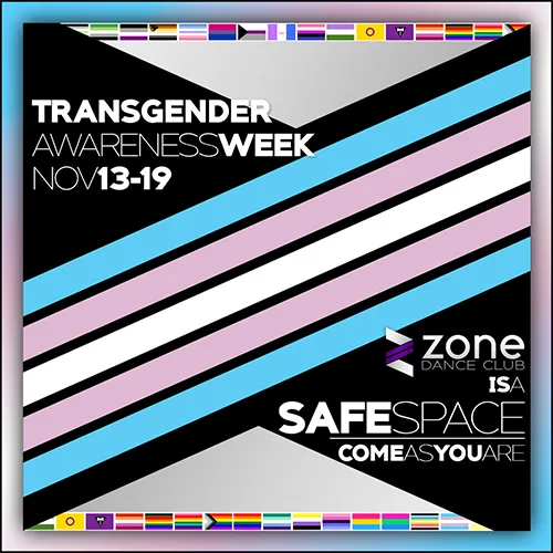
Before this partnership, The Zone lacked a unified brand identity, often relying on dated "rainbow disco ball" motifs and inconsistent wordmarks. The challenge was to move away from these visual clichés and build a professional, cohesive brand system that could keep pace with a high-energy nightlife environment while remaining deeply rooted in the Erie queer community.
Project Highlights
Insider-Led Strategy: Leveraging a dual role as designer and part-time staff, the brand was built from the "inside-out" to authentically reflect the club’s unique culture.
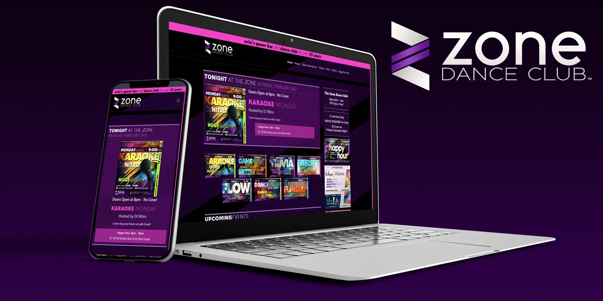
Dynamic Hero System: The custom-coded website automatically rotates hero content based on the day of the week, shifting focus from Trivia Night to Saturday Dance Parties without manual daily intervention.
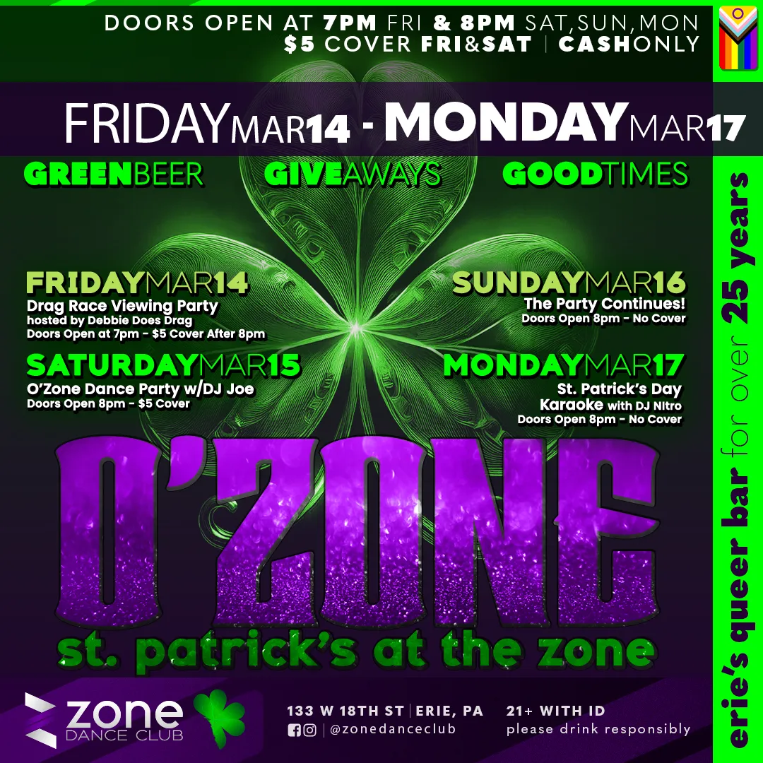
Rapid-Response Design: A workflow optimized for the fast-paced nightlife industry, allowing for immediate updates to drag cast lineups and community partnership graphics, such as Central Outreach Wellness events.
Whee! SiteStudio Pilot: The Zone serves as the flagship client for the custom Whee! SiteStudio CMS, proving that high-end, dynamic design can be managed through a simplified, code-free backend.
Design Rationale
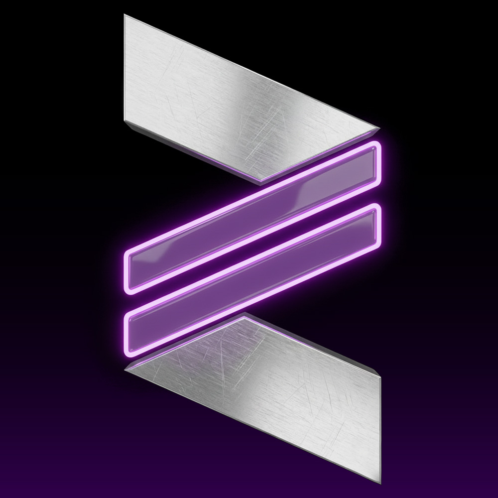
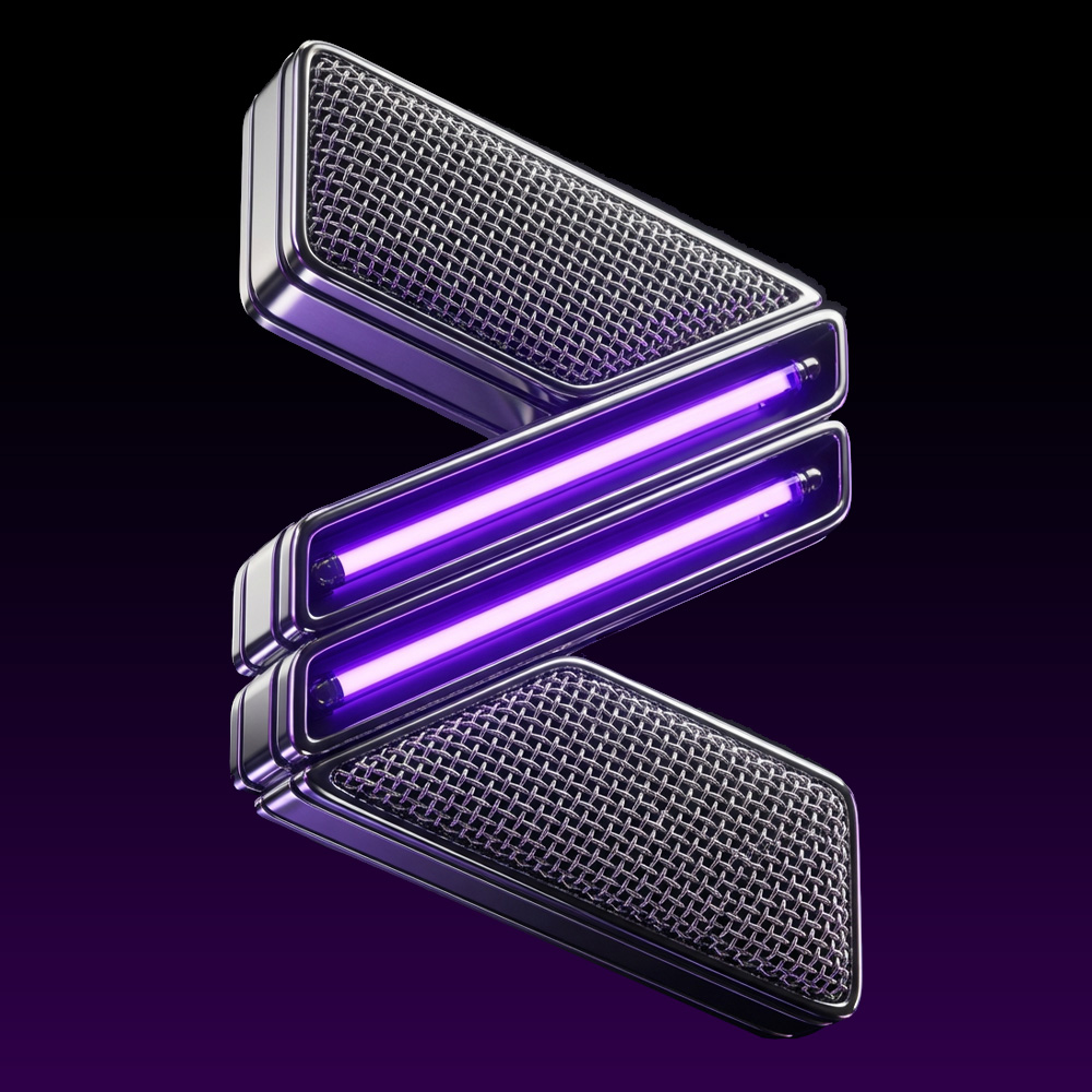
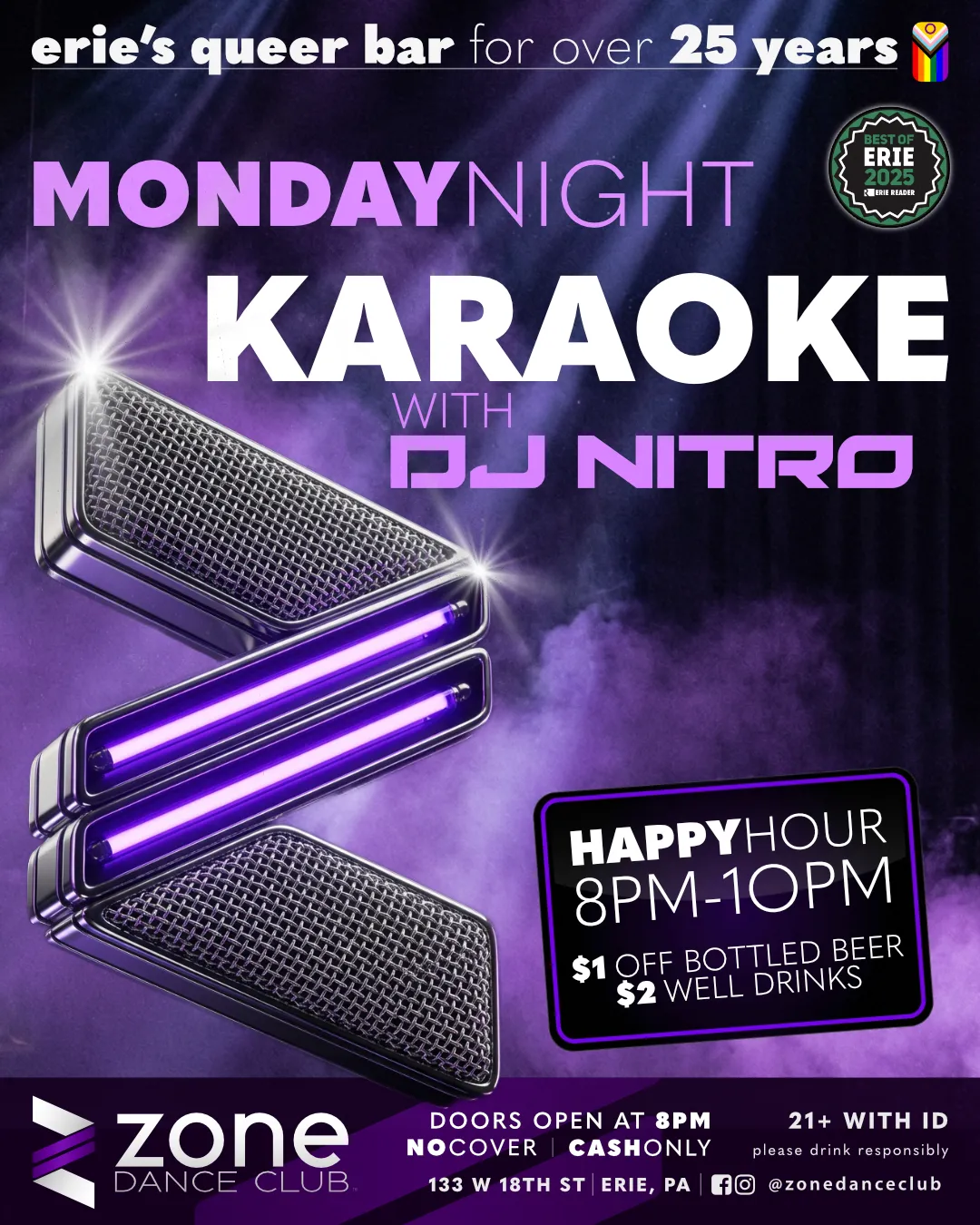
The Modern "Z": The dated rainbow disco ball was replaced with a geometric, forward-leaning "Z" icon. It features an integrated "equal sign" motif, subtly signaling that "everyone is welcome" while maintaining a sophisticated, modern edge.
Sophisticated Palette: Utilizing a deep purple gradient against sleek blacks and greys creates a high-end club aesthetic. This professional "dark mode" approach honors the club's pride roots in a more contemporary, refined way.
Typography: The wordmark utilizes a graphic, lowercase font, chosen to convey approachability and modern style, balancing the bold energy of the icon with clean, readable lines. Supporting typography includes varying weights of Quasimoda (Light, Medium, and Heavy) to build dynamic headlines, date lines, and varied promotional content.
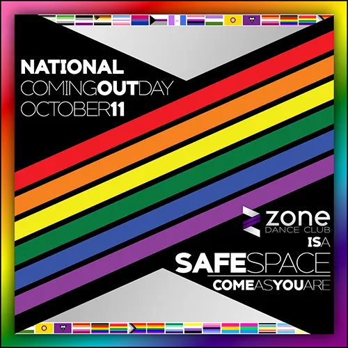
Adaptive Branding & Evolution: As part of the Brand Evolution package, the identity system is designed to be living and breathing. The core "Z" icon is built for versatility, capable of transforming to represent specific pride flags, holidays, or community milestones.
Brand Personality
The Zone's personality strikes a deliberate balance between high-energy vibrancy and irreverent fun. It is designed to be inclusive and approachable using bold geometric shapes and a structured typographic system to ensure the brand feels modern and professional, yet never elitist.
This multifaceted identity allows the brand to transition seamlessly across a diverse range of experiences: from the high-octane atmosphere of the Saturday night dance floor to the community-focused, supportive environments of weekday trivia and karaoke.
The sophisticated foundation of the core identity is brought to life through the "eclectic maximalist" layering of vibrant colors, camp design elements, and the playful, sharp-witted irreverence for which the queer community is known. It is a brand that takes its professional presence seriously, but never takes itself too seriously.
01. The System
Logo Marks
Primary Mark
To be used in 80% of applications. High contrast, legible at large and small scales.
Reversed Mark
Standard Icon Variants
Typography
AaBbCc123
Quasimoda Black | Quasimoda Light
Primary Headline Font
THE ZONE DANCE CLUB
SATURDAYSEPT26
AaBbCc123
Quasimoda Medium
Body Copy & Subtitles
The Zone stands as Erie's premier queer sanctuary where you can show up as your full self and find your family on the dance floor.
Color Palette
02. In Action
03. Brand Evolution
A living brand never stands still. How we keep the identity fresh year after year.
Adaptive Identity
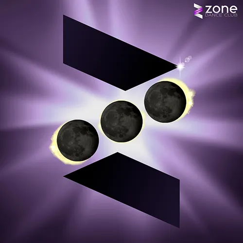
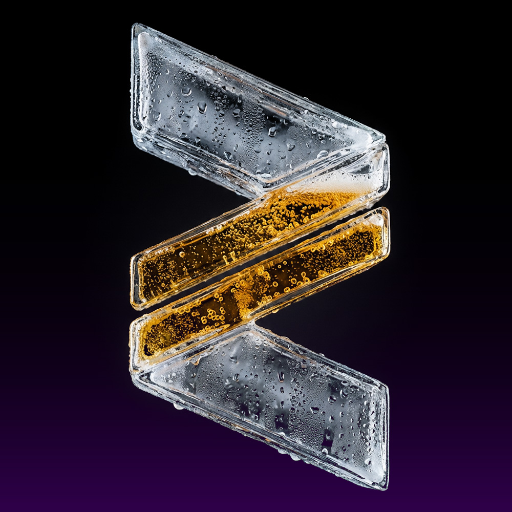
For the 2026 season, we introduced a dynamic icon system. While the core geometry of the "Z" remains constant, the textures and materials shift to match specific events or themes.
Strategy: Retention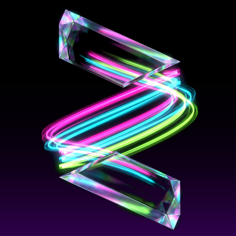 Flow
Flow
 Industrial
 Karaoke
 Thirsty
Annual Refresh
Maintaining recognition while give fresh face.
Neon colors
Shifted towards Adaptive Branding to reflect the "Brand Evolution" strategy.
whee /(h)wē/
interj.
an exclamation of joy, thrill, etc.
design /dɪzaɪn/
verb
to plan and fashion the form and structure of an object, work of art, decorative scheme, etc.
pride /praɪd/
noun
a sense of the respect that other people have for you, and that you have for yourself.
geek /gēk/
noun Slang.
a knowledgeable and obsessive enthusiast.